
Why Color Theory Matters for Getting Dressed
Most of us learned the color wheel in elementary school and promptly filed it away. But those same principles that explain why a sunset looks beautiful also explain why some outfits just work. Color coordination isn't about following rigid rules — it's about understanding why certain combinations feel harmonious so you can make intentional choices rather than guessing every morning.
Color does more than decorate — it shapes perception, signals mood, and influences how an outfit reads in different contexts. Once you understand the underlying mechanics, you'll spend less time second-guessing and more time getting dressed with genuine confidence.
90%
Of snap judgments about products involve color
Research cited in various color psychology studies suggests that up to 90% of an initial impression of a product — and by extension, an outfit — is influenced by color alone.
3
Core color strategies cover most outfit scenarios
Fashion educators generally agree that complementary contrast, tonal layering, and neutral anchoring are the three foundational approaches that address the vast majority of everyday dressing decisions.
The Three Core Color Relationships
Complementary Pairings
Complementary colors sit directly opposite each other on the color wheel — think blue and orange, red and green, or purple and yellow. These combinations create high contrast and visual energy, which is why they show up everywhere from sports uniforms to runway collections. In everyday dressing, a complementary pairing can make both colors appear more vivid than they would alone.
The key to wearing complementary colors without feeling like a walking art project: let one color dominate and use the other as an accent. A navy outfit with a rust-colored bag, for instance, is far more wearable than splitting the look 50/50.
Analogous and Tonal Pairings
Analogous colors sit next to each other on the color wheel — like green, teal, and blue — and naturally feel harmonious because they share undertones. Tonal dressing takes this further by working within a single hue: layering sage, olive, and forest green together, for example, creates a look that's cohesive and effortlessly sophisticated.
Tonal outfits are particularly useful for building a wardrobe that travels well and transitions across dress codes. For more on that kind of seasonal versatility, see seasonal wardrobe strategies that keep your closet functional year-round.
Neutral Anchoring
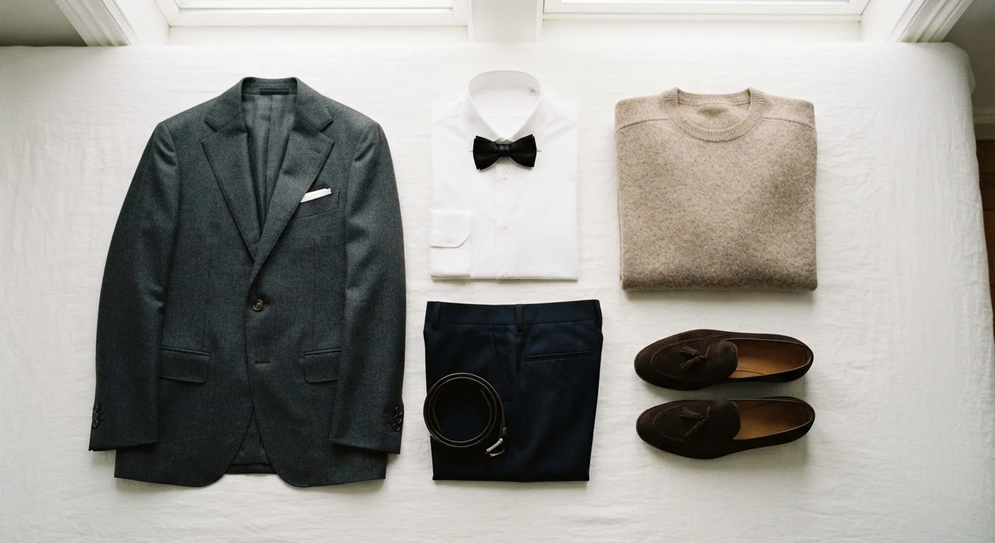
Neutral colors — black, white, gray, beige, camel, and navy — are the workhorses of any wardrobe. They coordinate with virtually everything, which makes them ideal for building a base that allows colorful or patterned pieces to integrate seamlessly. A mostly neutral wardrobe doesn't mean a boring one; it means you're creating space for intentional color moments rather than accidental clashes.
Start With a Two-Color Outfit
If color coordination feels overwhelming, begin with outfits that use only two colors — one dominant, one accent — plus any neutral. This constraint forces clarity and makes it much easier to see how color relationships actually function before adding complexity.
Undertones: The Hidden Layer of Coordination
Beyond hue, colors carry undertones — either warm (yellow, orange, or red-based) or cool (blue, green, or purple-based). Mixing colors that share an undertone direction tends to feel harmonious, while mixing opposite undertones can feel jarring — even when the hues seem similar.
Warm whites (with a cream or yellow cast) and cool whites (with a blue or gray cast) are a classic example. Pairing them reads as mismatched even though both are technically "white." The same logic applies across the entire palette: a warm olive and a cool sage may both be greens, but they don't naturally harmonize the way two warm greens would.
“Color is a power which directly influences the soul. It is the keyboard, the eyes are the hammers, and the soul is the piano with many strings.”
— Wassily Kandinsky, Painter and influential theorist of color and abstract art
Once you start noticing undertones, you'll also find it easier to understand why some colors feel particularly good on you — a concept explored more deeply in personal style approaches that balance proportion with identity.
Putting It All Together in Your Wardrobe
You don't need to master every color relationship — just pick two or three strategies that reflect how you like to dress. If you gravitate toward calm, quiet looks, tonal and neutral-anchoring approaches will serve you well. If you love visual energy and statement outfits, complementary pairings and color blocking are your tools.
Color coordination also plays a significant role when mixing patterns. Pattern mixing works best when the color palettes across prints share at least one common hue, which is essentially color theory applied to texture and print simultaneously.
For a broader look at how color fits into your overall identity as a dresser, auditing your wardrobe through the lens of both color and personal values can clarify what's actually working — and what's just taking up space.
Color "Rules" Are Starting Points, Not Laws
The principles covered here are frameworks derived from color theory and widely used in fashion — but they're not absolute. Personal style, cultural context, and individual taste all legitimately influence how colors are worn and perceived. Use these principles as tools to build confidence, then adapt them freely to suit your own aesthetic.